Idle Commander - Original V2
Updates:
LarsIsGaming (08/12/2022):
- We have a feedback / discussion thread started on r/incremental_games!
Overview
Idle Commander is an idle/incremental inspired by the likes of Total Annihilation, Supreme Commander and Planetary Annihilation.
This is an early Alpha build, there will be bugs and the balance/economy is far from final, the focus for this release is feedback and learning what people do and do not like.
Gameplay
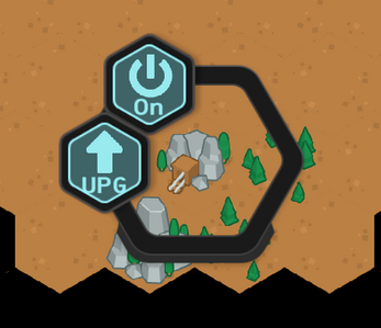
Structures can yield and consume resources so try to balance your economy, if you get yourself into a deficit and can't recover click a structure you have placed that consumes a resource and disable it.
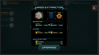
Clicking on a structure to interact with it also yields the possibility of upgrades. In the upgrade panel, there is a red bar that fills, you can ignore this as it's currently not completely implemented.
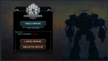
Your progress is saved every 10 seconds, you can go offline and come back later and your structures will have produced some resources for you (assuming you have capacity)
Attribution
- Art - Kenney.nl for the Tilemap & Icon packs
- General Support - Jip from Forged Alliance Forever for discussing implementations of resource systems and how they work in Supreme Commander
Feedback is greatly appreciated and please enjoy idle Commander!
Known Issues
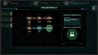
* A erroneous piece of UI shows up in the Research Project panel on the right, this can be ignored and will be removed in the future.
* Saves are not persistent across new builds because Itch and Unity don't play nicely. (Working on a long-term solution)
| Status | In development |
| Platforms | HTML5 |
| Rating | Rated 3.0 out of 5 stars (4 total ratings) |
| Authors | RiskyBusinessGames, Wobling, LarsIsGaming |
| Genre | Simulation |
| Made with | Unity |
| Tags | 2D, Hex Based, Idle, Incremental |

Comments
Log in with itch.io to leave a comment.
It's already so fun for the first version, and the toggles for resource drain are pretty design-wise for this kind of game. Looking forward to future updates!
Awesome, thanks for the kind words thdob!
Let us know if you have any ideas or features you'd like to see in the next versions!
Had everything researched before even putting the first radar thing down. Ended too quickly.
Edit: Explored map. Didn't find anything significant. Should I have?
Thanks for playing Murder_Mouse!
The alpha is currently about ~30 minutes of gameplay, to test out the core resource and construction system, and we'll be expanding the gameplay duration significantly with new features.
Unfortunately there is not any hidden stuff on the map once explored with Radars, but longer term, there will be additional mass deposits, collectable resources, secrets and other things.
If you have any gameplay ideas or feature requests, let us know!
Great game got all upgrades and explored half the map :)
Thanks MadMilligan! It's really great to hear you enjoyed the game. How did you find the game to play? Any problems / frustrating bits?
It's awesome. I got to the last research which costed 500! I love this game!
Thanks for playing Piggy, really happy to hear you enjoyed it and we hope to have some more content in the near future.
It looks fun, but the UI is really getting into me, everything is so hard to read, and you get thrown right into a ton of text.
Hi Killereks, thanks for taking the time to play and provide feedback, the UI is a changing piece of the project and feedback like yours allows us to move in a better direction.
A tutorial to help onboard is absolutely something that we will introduce to make the introduction period as smooth as possible
I’m glad I can help in some way, I would suggest using specific colours or better icons so u can differentiate between the resources needed. Having a modal for upgrading was quite distracting (maybe put prices inside the upgrade button or next to the building when hovered). I would heavily recommend getting inspiration from this game: NG Space Company It has a VERY good and clean UI/UX. I hope my comment didn’t sound too harsh! I realised I didn’t put many constructive criticisms to help you.
Hi Killereks, thanks for the feedback!I've not played NG Space Company, but did spend a load of time hacking around with the
The UI still needs some work, this was my main development focus on alpha 0.1.
Interesting thought about the modals, one thing we've been considering is having a right-hand side bar with a list of all the buildings on the map + upgrade buttons if you can afford it.
Currently there's definitely a bit of a roundabout rout to get the information you need to make decisions in the game, which is why we added the building level numbers to the main map view (previously you would need to open the modal each time to check the building level).
What are your thoughts on;
* having some indicator on the map (flashing level number?) to show you can afford a building upgrade?
* being able to toggle resource generation info on the map (along with the level)
* having a quick-upgrade option on the radial menu?
* having a _NG Space Company_ style details table of all your buildings, their current stats, and an upgrade button if affordable?
Many thanks for the valuable feedback, this is exactly what we need! And absolutely no need to apologise, constructive feedback is never harsh :D
Great!!
Thanks for playing Sanches, we appreciate it.
If you get factory and a mine after, you softlock yourself
You can tap on the Mass Extractor (Factory) and press the Turn Off button and then it will stop producing but it will also stop consuming your resources.
Please let me know if this doesn't resolve your issue and thanks for playing.